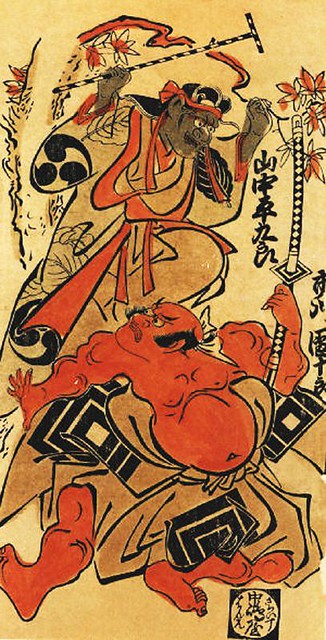
Saturday 25 March 2017

cop: sepia tones

a lot of traditional japanese wood block prints have a sepia tone to them. here is an example:
Related image
I wanted to try and replicate this aesthetic within my own journal. At first I thought of just doing a wash over all of the pieces of paper which could have been interesting but it would have taken a long time and made a lot of the pages very crinkly. And even though this is an important aesthetic from that era, it's not the only one. There are some prints you can find with a simple white background. However, I wanted to try and recreate this look in some of my pieces which I think I did quite successfully as you can see here:
 This is an illustration that you would see mainly on a fan for decoration. I wanted to try and work within a border because I thought it was interesting how it can be recreated with woodblock print.
 Although this one doesn't have the sepia background, I wanted to try something different and just incorporate the colour. I think it worked out really well and the contrast of the blue and the yellow is really striking.
 Here I wanted to show that the back of the lantern has  the sepia tone, whereas the face is supposed to be white because it is a 'yokai' which is a Japanese mythological ghost.
 A scene from a book that I saw. I'm not sure if I like how this one came out because I think that it has more african vibes to japanese, i'm not really sure what I did wrong but I would have to revisit this again if I wanted to try and do the same scene. I think the type of tree that I used doesn't fit with the Japanese era.
The famous NAMAZU catfish. He is the earthshaker, set to destroy Japan when he wiggles. I really like how this one came out because it has the sepia toned background and the simple ink drawing aesthetic that I think I successfully captured.


All in all, i think these drawings have helped me to understand how sepia tone backgrounds can help to communicate different ideas. It looks more 'traditional' and washed out. Is this the message they want to get across? Or is it just the a type of paper that they used?

Saturday 18 March 2017

cop: study task 9


What are they?

Japanese / Traditional / Aesthetics / Floating World (Ukiyo-e) / Communication / Fineliner / Replication / Block Colour / Repurposing / Woodblock Printing

What do they mean?

I chose these words because they are key points to my essay. Japanese and Woodblock Printing are obvious, as this is the main focus of my essay. Aesthetics relates more to my journal as this is what I tried to tackle within that. Ukiyo-e is one of the types of Japanese print that I looked at the most, as it's the most interesting to me. Replication and Re-purposing are about me and others taking the traditional Japanese art and doing it again for different means. Fineliner and Block colour are about the aesthetics of the art that I want to try and replicate within my journal. 

Relate the words together in pairs and write why they relate to your project – be specific.

Japanese - Woodblock Print
Ukiyo-e - Aesthetics
Fineliner - Blockcolour
Replication - Repurposing
Aesthetics - Replication
Ukiyo-e - Woodblock Print
Woodblock Print - Communication
Communication - Aesthetics

Task 2

1. Researching Woodblock Printing Process
2. Getting certain books out of the Library that really helped me to develop my essay, i.e Japanese Popular Prints
3. Looking at Hokusai and merchandise surrounding that
4. Looked at contemporary users of woodblock print.
5. Determined how I wanted my journal to look, Aesthetics
6. Realised that woodblock printing would be a hard process for me to replicate so using aesthetics would help me to keep good time management
7. Finishing my visual journal
8. Discovered websites such as JSTOR which helped me to locate journals and theorists
9. Looked at Japanese Graphics and how it has evolved
10. Worked out how well it was all communicated

Friday 10 March 2017

cop: hokusai re-purposing


These are some pages from my sketchbook where I tried out re-purposing Hokusai's wave, much like all the merchandise I'd been seeing. At first I was looking at using the tools for woodblock printing and how it could be applied to that, then I thought about how they use it on mugs and keyrings, sort of like collectables of Japanese culture. I wanted to do this because I thought it would be good for me to see what it's like to repurpose, and interesting to see how it would work on different products. There really is a lot of ways you can do this and make it work.